Primary Logo
The UWF primary logo is the institution’s central identity mark. It is the foundation of our visual identity system and has been carefully crafted to present a distinctive, simple and timeless image of UWF. In 2018, we reintroduced the evolving Nautilus Shell into our identity to honor our past and turn the page on the next chapter of our history. For more information about the evolving nautilus, visit the Evolving Nautilus FAQ.
In order to maintain consistency, the standards for use of the UWF’s official primary logo are as follows:
- The UWF primary logo should never be recreated or emulated and alterations are prohibited. This includes alterations to the nautilus shell, the text within the logo, the line element below “West” and the proportions of all elements. The addition of taglines, icons or graphic elements is also prohibited. Please refer to improper usage for more details.
- The UWF primary logo may be portrayed in two-color or one-color versions. All exceptions must be approved in advance on a case-by-case basis by University Marketing and Communications.
- The two-color version consists of UWF Blue for the text and the bottom portion of the nautilus shell, with the line element and the shell’s sun rays in Nautilus Blue. This is the primary color configuration to be used whenever possible.
- The one-color version may only be used in UWF Blue, black and white. UWF Blue should be used whenever possible.
- The UWF primary logo must be surrounded by an official clear area. Do not place text over the logo or modify elements of the logo. Please refer to the section below regarding the standards for the official clear area.
- When scaling, the primary vertical version should never be scaled smaller than 0.75 inches in width and the primary horizontal version should never be scaled smaller than 1.25 inch in width. The orientation should be selected based on the space allotted for the logo.

Secondary Logo
A secondary configuration of the primary logo provides a solution to narrow spatial restrictions. The secondary logo should follow the same standards as the UWF primary logo, however, it should never be scaled smaller than 2 inches in width.

Official Clear Area
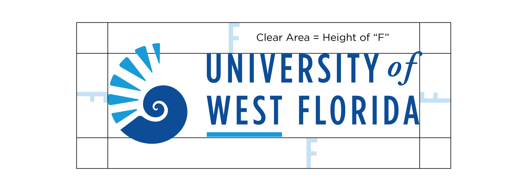
All University logos and official identifiers are to be surrounded by a clear area. This is the protected area around the logos. No other graphics or words are to overprint, touch or appear in this clear area. To ensure that clear space is maintained around the logo for legibility, text and graphics must follow the standard illustrated here. Use the height of the letter “F” in the UWF primary logo as a measuring tool to help maintain an appropriate clear area.

Logo Downloads
Download the institutional logos: UWF Logos (zip)
All downloads must be used according to the standards as outlined above.


