Side Essentials Overview
The content types listed in this group help build out the left column of your site. They're what you'll use to display contact information, featured links, and even a picture gallery!
Important Information
The side column of your site can be used for more than just site navigation. There are several content types that can display in this area. The Side General Content and Media Panel are demonstrated on this page, but there are a few others in this guide that can display in the side column as well:
At a Glance
- Requires Placeholder: No
- Placement: Left_Column
- Special Setup: None
- Image Sizes:
- Landscape preferred
- Max width: 269px
- Height: Variable
In an effort to remove confusion and redundancies in the CMS, many of the original side-column content types have been consolidated into the Side General Content type.
It replaces the following legacy items:
- Image Side-Promo Box
- Image Side-Promo Box Doc
- Left Side-Info Box
- Side-Promo Box
When content types are phased out like this, they are appended with the tag [Deprecated]. If you notice that your left column contains these content types, and you would like assistance transitioning the content into the new Side General Content type, contact Web Support.
Side Note
When the CMS was originally implemented, one of the major building steps was mirroring the "Left_Column" throughout all the site's subsections. This is no longer required as of a recent update.
Side: General Content contains the following elements:
- Name - Used in Sitemanager only. This does NOT show up on your webpage.
- Title - This will be your content heading (<h2>). Larger, bold text with extra spacing.
- Main Body - The main area for your content.
- Image - Use this to select an image from the Media Library.
- What should the Image link to? - This dropdown tells the CMS to use either the 'Link to External Page', 'Link to Section', or 'No Link' for the image provided.
- Image Section Link - If 'Link to Section' was selected above, use this field to select the internal page link.
- Image External Link - If 'Link to External Page' was selected above, fill in an external URL in this field.
- Button Text - Text that will appear on a stylized button.
- Button Section Link - Select an internal page to link to here.
- Button Color - Select from blue or green.
- Image - Document - Select a thumbnail sized image from the Media Library that can link to a document or full size version of the same image.
- Link - Document - Select a document or full size image from the Media Library for the 'Image - Document' destination.
- Add Patterned Line - Similar to add green line, this helps break up content on the page.
Side General Content
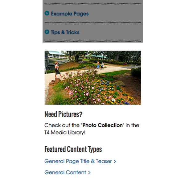
Just like the General Content type, this is a versatile content type that is great for department contact information, promotional images, featured links, etc.
Media Panel
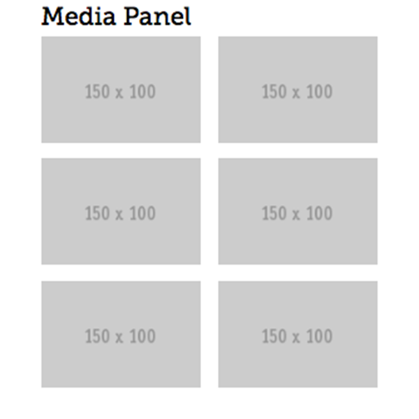
An under-utilized content type; this can highlight up to 6 images in the left column. When an image is clicked on, a lightbox effect displays a larger image (similar to the Image Gallery)