


Headlines, Subheads and Body Copy
Gotham Condensed and Nitti Grotesk are the institution’s primary sans-serif typefaces, and Chronicle Deck is the primary serif typeface. When used together, they create a balanced look and feel for all messaging.
Each section below outlines acceptable alternatives for instances when brand fonts are not available. Note that brand fonts should be used for all official University communications, internally and externally.
Guidance for where to purchase the font packages is available below.
Headlines
Gotham Condensed
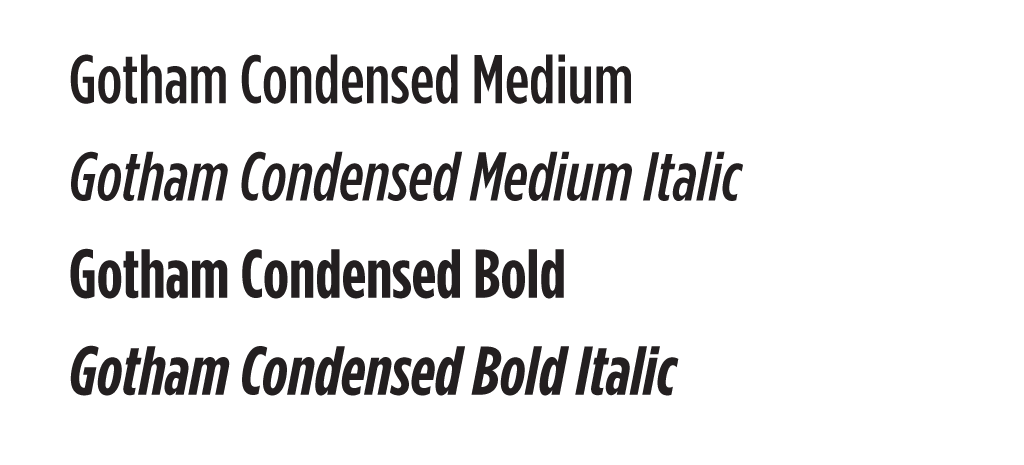
Gotham Condensed is UWF’s primary headline typeface and should be used for large display text. This classic condensed sans-serif typeface, with its clean, modern lines and elegant curves, looks best at larger sizes in our visual identity system.
The default weight to be used is Medium or Bold, title-case. It can be used in all-caps in limited situations such as on large directional banners. Medium weight is the default, however when headlines become longer, and thus smaller in scale, move up to the next font weight, Gotham Condensed Bold, to maintain the same visual hierarchy.
Although other weights and styles are available in the Gotham Condensed family, only the styles listed have been selected for use within the UWF visual identity system. No other weights should be used, unless approved by University Marketing and Communications.
Purchase a License
Gotham Condensed can be purchased at typography.com.
Typeface Substitute
In the absence of Gotham Condensed, the Adobe Font equivalent FortXC can be used. Alternatively, Arial should be used if a web-safe font is needed.
Nitti Grotesk
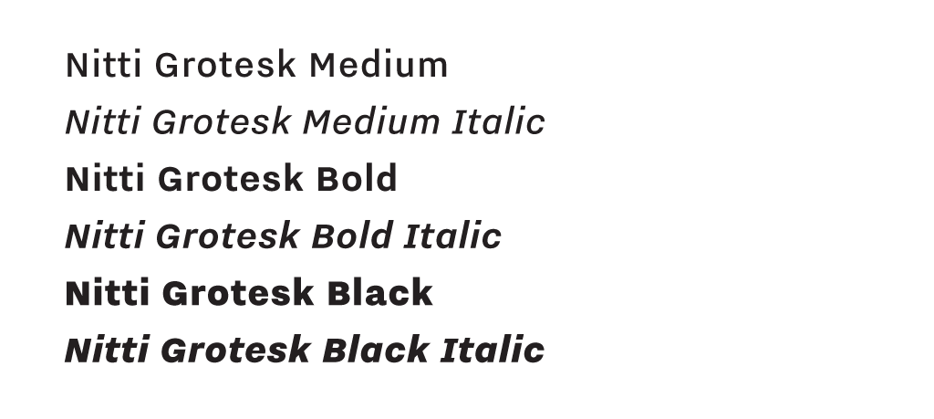
Nitti Grotesk is a clean, rational sans-serif typeface that balances clarity and authority. Its unique name comes from the historic typographic term “Grotesque” which refers to san-serif letterforms with varied proportions and stroke endings. It communicates modern credibility while maintaining a professional, enduring presence. Bold or Black weights can be used as a headline font in addition to Gotham Condensed. These weights are intended to be secondary headline choices and used in all-caps, although elevating them to a primary headline is permitted.
Purchase a License
Nitti Grotesk is an Adobe Font which can be activated through the University’s enterprise Adobe Creative Cloud license.
Typeface Substitute
In the absence of Nitti Grotesk, the Google Font equivalent Inter can be used. Alternatively, Arial should be used if a web-safe font is needed.
Sans-Serif Subheads and Body Copy
Nitti Grotesk
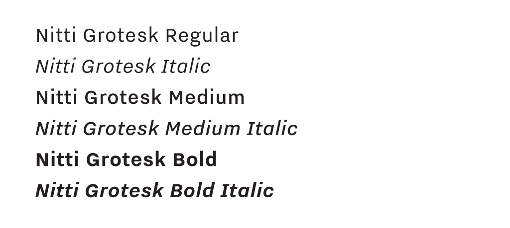
Nitti Grotesk is not only a UWF headline typeface, but it also works across subheads and body copy because of its versatility and clean, inviting structure, pairing seamlessly with accent fonts.
The default styles to be used are Regular, Medium or Bold. Intro or lead-in copy for ads is Bold, either title-case or all-caps, while the remaining body copy is Regular.
Other supporting styles of Gotham may also be used, however, they should be reserved for emphasis or smaller applications.
Purchase a License
Nitti Grotesk is an Adobe Font which can be activated through the University’s enterprise Adobe Creative Cloud license.
Typeface Substitute
In the absence of Nitti Grotesk, the Google Font equivalent Inter can be used. Alternatively, Arial should be used if a web-safe font is needed.
Serif Subheads and Body Copy
Chronicle Deck
Chronicle Deck is a serif font and can be used as a subhead, but is predominantly used as body copy. Its legibility in small point sizes, ability to withstand the effects of different media and inviting characteristics make this a valuable typeface. Its primary use is as body copy in our bi-annual alumni periodical Connection Magazine or on more formal communications such as invitations or donor materials.

Purchase a License
Chronicle Deck can also be purchased at typography.com.
Typeface Substitute
In cases where Chronicle Deck is not available, Georgia is recommended as the substitute.